
The Goal
Create a brand identity for a modern day church.
Project Overview
The Hope Center team approached me to create their logo in preparation for their opening. They needed a combination mark that was flexible and could be adapted to various platforms.
Core Values
God above all
Generosity
Growth/Thriving
Innovation
Community
Leadership
Parameters
Modern
Fresh
Flexible
No use of cliche church symbols
Color Inspiration


All colors have special meanings and vary depending on the shade and tint. Before I put pencil to paper, I focused on selecting colors that would enhance the final design.
The color selection played a vital role in visually communicating the message that the church wanted to give prospective members. Since the logo called for a fresh look, I chose color combinations that were both vibrant and rich.
The colors I moved forward with were Magenta and Yellow-Orange; I added a darker shade of magenta for depth later in the process.

#CF2F85

#F89632
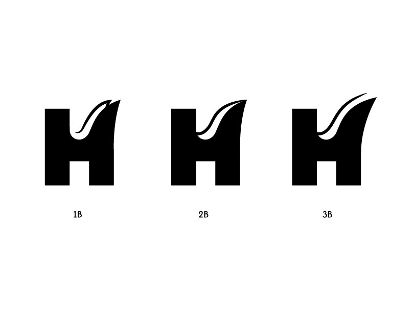
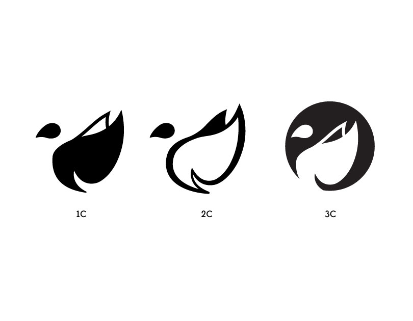
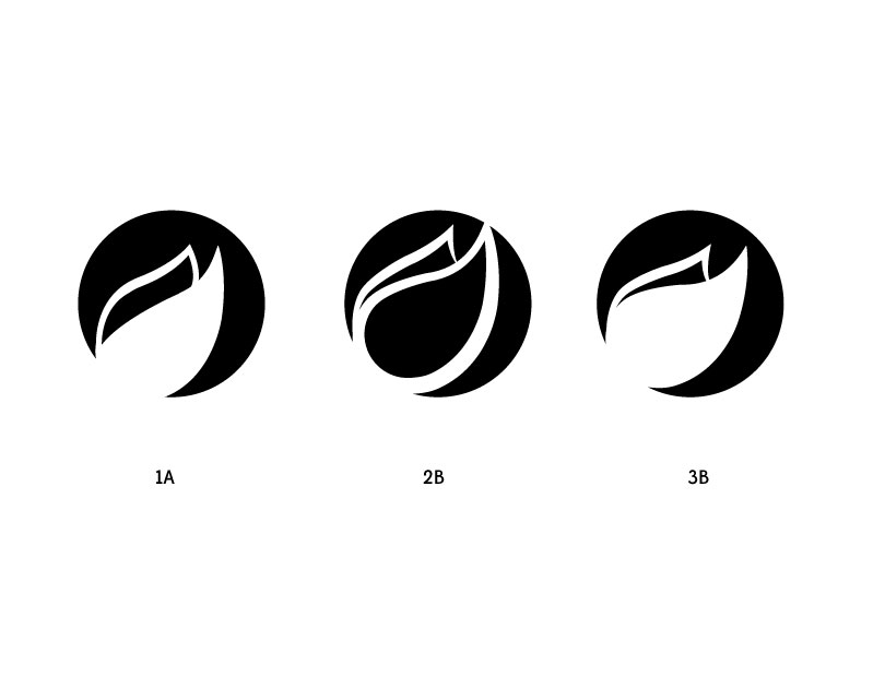
Creating The Symbol
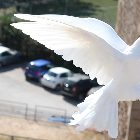


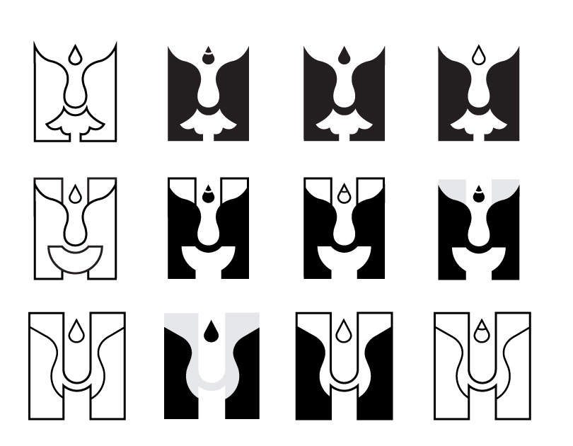
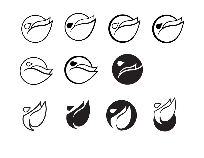
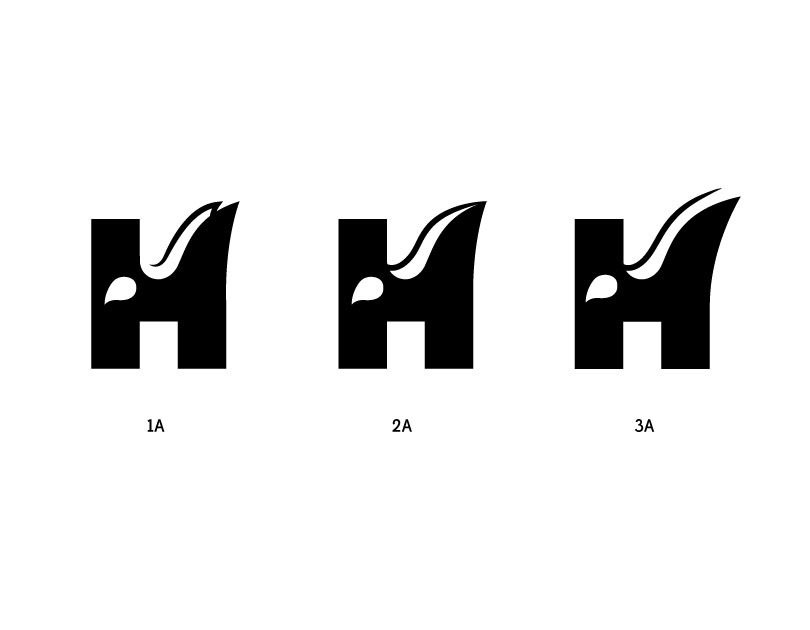
In the beginning, I explored the idea of using the letter H as the focal point of the design, which inspired many interpretations. After working through various concepts, I decided the best way to grasp the essence of a “church” was to include a symbol - I choose to incorporate a dove. The dove is symbolic in the bible and represents eternal love, hope and peace – characteristics that are prominent in the HC core values.
Choosing to use the dove was risky as it was among the cliche imagery that the church was against, however my approach was to incorporate the silhouette using prominent features (wingspan, shape of the head and curves of the wings) of the dove to create an appealing design.
Making the Name

For the name, I selected the Panagram typeface for its circular open counters, sharp finials and ascenders. These features fit nicely with the sharp and rounded elements within the symbol.
Final Design

Primary Logo

Black Version

White Version